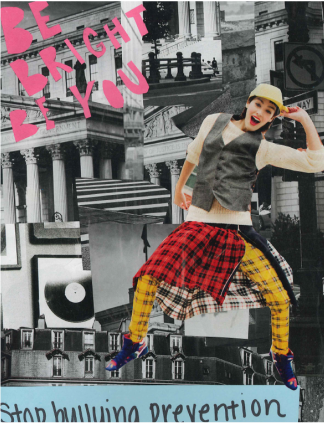
The project that you are looking at here is the magazine ad project. This was a project which we had to make an advertisement out of cut up magazine scraps and mix it all together. The project was based around the elements and principles of design. The elements and principles of design are line, texture, color, balance, emphasis, and shape. We used the materials magazines, glue sticks, construction paper, markers, and scissors. What I chose my ad to be was on bullying. I started off by cutting out different pictures that were taken in black and white and I mashed them together. The black and white show line mostly but texture is also added in. The girl in the collage shows emphasis like she is popping out at you. I put only her in color because she was wearing very unordinary clothes and stood out of the crowd in my eye. The girl also has a play in my slogan "Be bright, Be you" I want people to know that it's okay to stand out and not be like other people and this is exactly what that girl is doing. In this project I learned the elements and principles of design since I have never known of them before and how different things can come together and portray them.
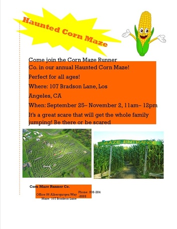
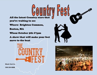
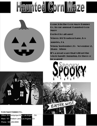
For this project we had to make three flyers. The first flyer we used a template from Microsoft Publisher. The theme had to be something about Halloween, so I decided a Haunted Corn Maze. The second flyer had to start from a blank document and go from there. My theme of this one was a Country music festival. It was an easy topic that can easily be working off of. The third and final flyer was a copy of the first but in black and white with the same information, but a different setup. For the information we had to explain who, what, when, where, why, and how. The place could be made up or an actual place. In the flyers we used the elements and principles of design just how we used them in the last project that we did. the elements and principles of design are line, texture, color, balance, emphasis, and shape. We included Wordart, pictures, and very bright and vibrant colors to make everything pop out at you. In this project I learned how to make a flyer and what will attract people's attention to make sure they will show up and enjoy the entertainment.
|
|
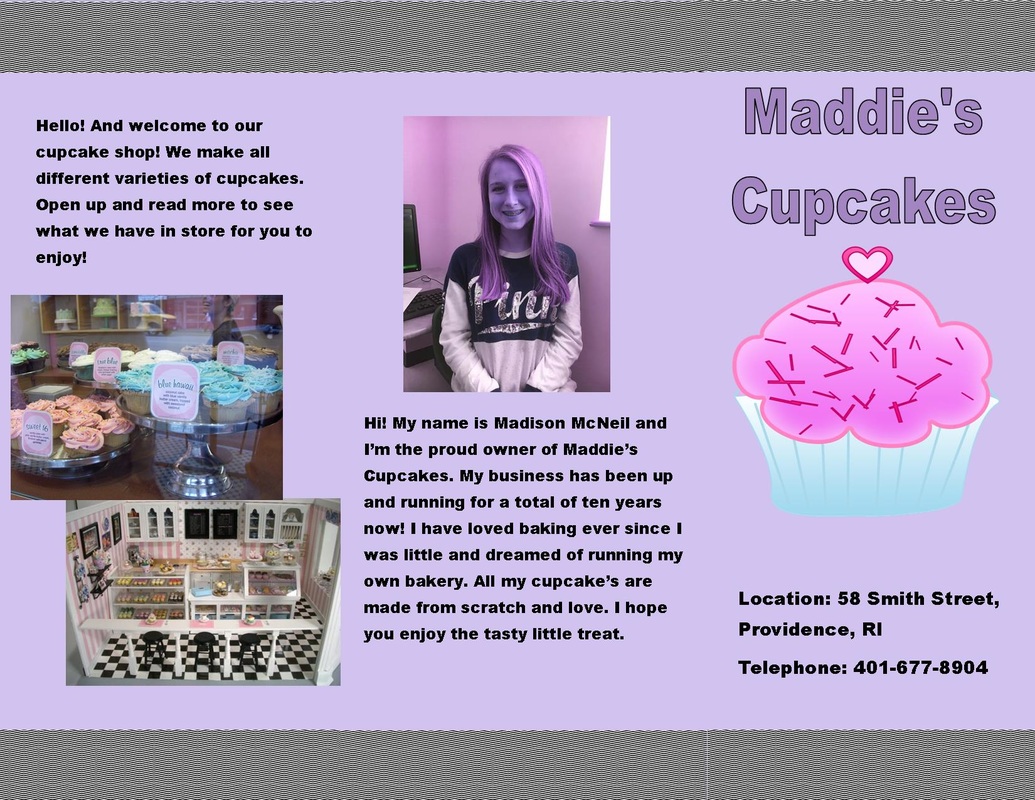
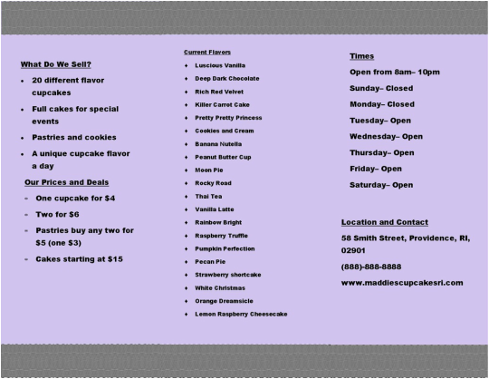
In this project we had to create a brochure for a company that we had to make up. The company that I had created was "Maddie's Cupcakes." In our brochure we had to include where your company is located, information about what you sell, and an auto- biography of yourself. We had to gather information on our product that we are selling, and had to be creative about our brochure and add something appealing to the eye. On my first page I only stated the name and the location of my company. On the inside flap that you first look at I gave an introduction of my shop and some little pictures to go along with it. On the next opening flap I included all our current prices and deals, along with what we have to sell. In the middle of the brochure it has all our current flavors, which are 20 flavors to be exact. On the last inside flap it has the times that we are open and the location and contact. On the last and final flap which is the back of the brochure has my information. There is a picture of me and a paragraph all about me and my products. In this project I learned how to use the machine in the back of the room that folds the brochures perfectly in line and how to put information all in one place and how to cut back on putting to much information.
|
|
|
|
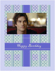
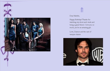
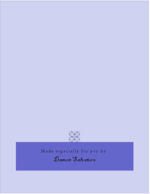
In this project we had to make a greeting card to ourselves from a celebrity. We had to include a picture of them that we made five edits of and other pictures can be included. I first started out with a greeting card template and moved some things around. I moved the purple border that say happy birthday down and added a picture of Damon Salvatore from the show "Vampire Diaries." On the inside of the greeting card I put a picture of the entire cast and yet another picture of Damon Salvatore. I put a tiny message that would be from him to me and finished it off with the last page of just plain purple and a tiny flower On the top of a darker shade of purple with it saying specially made by Damon Salvatore. On this project we had to use the elements and principles of design which are shape, line, texture, color, balance, and emphasis. What I learned in this project was how to edit pictures in different ways.
|
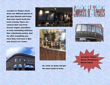
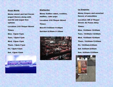
In this project we made a brochure for our field trip that we took on Friday October 28. For the field trip we went to Thayer street in Providence, Rhode Island. We spent the day with our groups looking at all the different stores and restaurants. Our group was given a topic and that topic was Sweets n' Treats. There weren't many options for us, but there were enough to be able to do the project. In the brochure we had to include some companies that sold these sweets n' treats and had to explain each one. In mine I included where it was located, what they have to sell, and the times they are open during the day. We had to have a minimum of four pictures in it with them all edited in Adobe Photoshop. The places I used were Froyo World, Ben and Jerry's Ice cream, Starbucks, and La Creperie. What I learned from this project is how to expand on better backgrounds and use texture in Microsoft Publisher.